Results viewer
A virtualized results grid with sorting, filtering, CSV / JSON export, and a built-in chart view.
Overview
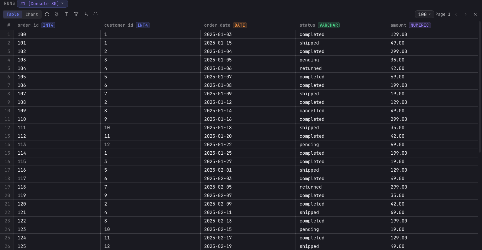
Query results render in a pane below the editor. The grid is virtualized with
@tanstack/react-virtual, so only the visible rows are drawn and large result sets
scroll smoothly. Results are paginated, with a selectable page size of 25, 50, 100, 250, or
500 rows.
View modes
The results toolbar switches the pane between two modes:
- Table — the default grid of rows and columns.
- Chart — a visualization of the current result (see below).
Working with the grid
- Sort — click a column header to sort ascending, again for descending, again to clear. Sorting is client-side over the loaded rows.
- Filter () — toggle the filter row and type a SQL
WHEREexpression, then apply or clear it. - Resize columns — drag a column's right border. Widths are remembered per tab.
- Select & copy — click a cell to select it, navigate with the arrow keys, and press ⌘C to copy its value.
- Row detail () — expand the selected row as formatted JSON.
- Query text () — view the exact SQL that produced this result.
- Execution plan () — inspect the plan for a cross-source query, where it is available.
Exporting
The download button () in the results toolbar exports the result set to a file:
- CSV — RFC 4180 quoting, with
NULLwritten as an empty field. - JSON — one object per row, with
NULLfields written asnull.
Charts
Switching a result to the Chart view turns it into a visualization, rendered
with Recharts. The chart and the table share the same underlying result, so there
is no separate dashboard or export step: pick the chart view, map columns to axes, and the
chart renders live.
When you first open the chart view, Arris seeds a default chart from the result's columns. You refine it from the chart editor in the right sidebar, choosing the chart type, the X / Y columns, an optional series-split column, an aggregation, and styling.
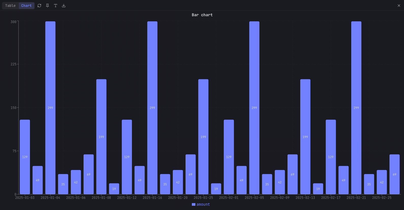
Chart types
| Type | Description |
|---|---|
| Bar | Vertical or horizontal bars, with grouping or stacking. |
| Line | Connected points with selectable curve interpolation. |
| Area | Filled line with adjustable fill opacity and stacking. |
| Combo | Bars and lines overlaid on the same axes. |
| Histogram | Binned frequency of a continuous column. |
| Pie | Proportional slices of a whole. |
| Donut | Pie with a configurable inner radius. |
| Scatter | X / Y points for correlation. |
| Bubble | Scatter with a Z column controlling point size. |
| Radar | Multi-axis polygon across several dimensions. |
| Treemap | Nested rectangles sized by value. |
| Funnel | Progressively narrowing stages. |
| KPI | A single-value indicator card. |
Multi-series rendering by a series-split column applies to the bar, line, and area types; the other types plot one measure per series.
Chart configuration
The chart editor maps result columns to the chart and controls its appearance:
| Setting | Description |
|---|---|
| X / Y / Z columns | The horizontal axis, one or more measure columns, and an optional size column for bubble charts. |
| Series column | Splits a measure into one series per distinct value (bar, line, area). |
| Aggregation | None, sum, average, min, max, or count, applied per X value. |
| Title | Chart heading text. |
| Colors | Per-series palette, defaulting to a built-in six-color set. |
| Line style | Solid, dashed, or dotted, with adjustable stroke width and curve type. |
| Stacking | None, stacked, or 100% stacked (bar, area). |
| Bar orientation | Vertical or horizontal. |
| Axes | Axis titles, manual min / max bounds, X label angle, and a linear or log Y scale. |
| Reference line | A horizontal line at a chosen Y value. |
| Legend & grid | Toggle the legend (and its position), grid lines, and data labels. |
| Donut radius | Inner radius for the donut type. |